How to Choose the Perfect Display Format for Your Recipe Book
Understand HubFit's 4 display formats for recipe books: large cards, squares, narrow cards, and list. Learn when to use each for maximum engagement.
Your recipe book’s display format is more important than you might think. The same recipes presented in different layouts can feel completely different to clients. One format might feel overwhelming, while another feels inspiring. The difference comes down to how meals are visually presented.
HubFit offers four distinct display formats, each optimized for different use cases and client preferences. Let’s explore each one and help you choose the right fit for your coaching style.
1. Large Cards (The Showstopper)
Large cards display meals as full-width cards in a slideshow-style layout. Each card prominently features the meal image, name, description, and other details. Clients can click to dive deeper or swipe to the next recipe.
Visual impact: This format is visually stunning. It’s cinematic and makes each recipe feel special and intentional.
Desktop experience: Beautiful full-screen cards, easy swiping, immersive browsing.
Mobile experience: Full-width cards that feel premium and engaging. Clients naturally scroll through to discover options.
Best for:
- Coaches emphasizing visual inspiration
- High-end or premium coaching brands
- Recipe books with 5-15 items (shorter, curated collections)
- Coaches who want meals to feel like coveted resources
Client psychology: Large cards say “this is quality.” Each recipe gets breathing room and respect. Clients feel like they’re reading a well-designed magazine.
Downside: With too many recipes, clients get “scrolling fatigue.” Large cards work best when quality is emphasized over quantity.
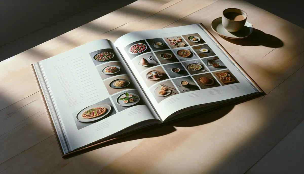
2. Squares (The Efficient Grid)
Squares display meals in a clean grid layout, similar to Instagram or Pinterest. Each square shows the meal image with the name below. Clients can quickly scan and tap to see details.
Visual impact: Compact, modern, gallery-style. Feels contemporary and tech-forward.
Desktop experience: A neat grid that fits many recipes on screen. Clients can scan options quickly without scrolling excessively.
Mobile experience: Perfect for mobile-first browsing. Fits 2-3 squares per row, making it natural to scroll and explore.
Best for:
- Larger recipe books (20+ items)
- Coaches who want visual browsing with efficiency
- Clients who prefer to scan and choose quickly
- Mobile-first audiences
- Contemporary, trendy coaching brands
Client psychology: Squares feel like possibilities. They see many options at once and feel empowered by choice. It’s the “which one do I want today?” experience.
Downside: With very few recipes (under 8), squares can look sparse. With low-quality images, the gallery effect falls apart.
3. Narrow Cards (The Balanced Approach)
Narrow cards present meals in a horizontal scroll layout with narrower cards. Clients typically see 2-3 recipes at once and swipe to reveal more.
Visual impact: Modern, balanced, contemporary without being minimalist.
Desktop experience: A horizontal carousel that feels interactive. Shows multiple options simultaneously while maintaining focus.
Mobile experience: Natural swiping behavior. Shows 2-3 options at a time, making browsing feel intuitive.
Best for:
- Mid-size recipe books (10-25 items)
- Coaches wanting balance between showcase and scanability
- A more modern feel than large cards, but more visual than pure lists
- Communities emphasizing both quality and variety
- Clients who want to compare options side-by-side
Client psychology: Narrow cards create curiosity. They see multiple options but can focus on one at a time. It’s the “what else is here?” experience.
Downside: Requires horizontal scrolling/swiping, which some users find less intuitive than vertical scrolling. Images need to be good quality to shine in the limited space.
4. List (The Information-Dense Option)
List format presents meals in a simple vertical layout with thumbnail images and text. Each row shows the meal name, a small image, and potentially additional details like macros or prep time.
Visual impact: Utilitarian, text-focused, minimal. Emphasizes information over visual design.
Desktop experience: Traditional list view. Easy to scan quickly, search efficiently, sort by filters.
Mobile experience: Compact and scrollable. Maximizes information density on smaller screens.
Best for:
- Coaches who prioritize information delivery over visual appeal
- Recipes with important supplementary data (macros, allergens, prep time)
- Larger recipe collections where navigation is essential
- Clients who want to search, filter, and find quickly
- Macro-tracking clients who need detailed nutritional information
- No-frills, utilitarian nutrition coaching
Client psychology: List format says “this is a resource tool.” Clients come here to find specific meals, not to get inspired. It’s efficient and practical.
Downside: Less visually inspiring. If your brand is about excitement and culinary adventure, pure list format might feel bland.
Choosing Your Format: Decision Framework
Ask yourself these questions:
What’s your coaching philosophy?
- Inspiration-focused? → Large Cards or Narrow Cards
- Efficiency-focused? → Squares or List
- Information-density-focused? → List
- Balance of visual and practical? → Narrow Cards
How many recipes are you including?
- Under 10 recipes → Large Cards
- 10-20 recipes → Large Cards or Narrow Cards
- 20-35 recipes → Narrow Cards or Squares
- 35+ recipes → Squares
- Large collections → List (with search/filter)
What’s your target client like?
- Visual, mobile-first, younger audience? → Squares
- Performance-focused, data-oriented? → List
- Seeking inspiration and guidance? → Large Cards or Narrow Cards
- Busy professionals? → Squares or List
What kind of recipes are you featuring?
- Beautiful, photogenic dishes? → Large Cards or Squares (prioritize high-quality images)
- Complex recipes with many macro details? → List or Narrow Cards
- Simple, ingredient-focused? → Squares or List
Format Combinations
You don’t have to choose just one format for all your recipe books. Consider:
- Recipe Book 1: “Inspiration & Ideas” (Large Cards format) - fewer, premium recipes
- Recipe Book 2: “Daily Meal Options” (Squares format) - larger collection for variety
- Recipe Book 3: “Macro Targets & Tracking” (List format) - detailed nutritional information
This approach serves different client needs simultaneously.
Mobile Always Comes First
Whichever format you choose, test it on mobile. Most of your clients will view your recipe book on their phones. A beautiful format on desktop that’s awkward on mobile defeats the purpose.
All HubFit formats are mobile-optimized, but the experience varies:
- Large Cards: Best mobile experience
- Squares: Excellent mobile experience
- Narrow Cards: Good mobile experience (swiping required)
- List: Best mobile experience for information density
Making Your Format Decision in HubFit
The good news: you’re not locked into a format forever. You can test different formats and see what resonates with your clients. Pay attention to:
- Which recipe books get the most engagement?
- What do clients say about your recipe books?
- Which format leads to actual cooking and implementation?
Use client behavior to refine your choices.
The Format Matters More Than You Think
Your recipe book’s display format shapes the entire experience. Large cards whisper “quality and inspiration.” Squares announce “options and variety.” Narrow cards balance both. Lists declare “information and efficiency.”
Choose the format that aligns with your coaching philosophy and your clients’ needs. Then commit to it, ensure your recipe images are high-quality, and watch your clients engage.
Ready to build? Check out our complete guide on creating your first recipe book or explore creative section ideas that pair beautifully with each format.
Your format choice is the frame. Make sure the content inside is stunning, and your clients will come back again and again.

The HubFit team shares expert insights on training, nutrition, and wellness to help coaches and clients achieve their fitness goals.