How to Choose the Best Layout for Your On-Demand Workout Library
List, carousel, narrow cards, or grid? Learn which layout works best for different types of workout content.
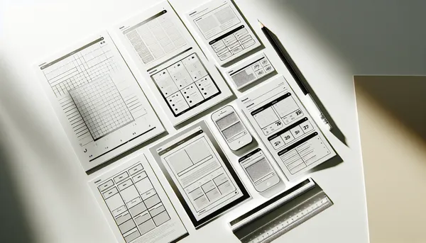
One of the most powerful features in HubFit’s Workout Studio is the ability to customize how workouts appear to your clients. You’re not locked into one template. Instead, each section can have its own layout: visual, practical, and perfectly tailored to the content inside.
But with four layout options to choose from, it’s natural to wonder: which one should I use? This guide breaks down each layout, explains when to use it, and shows you how to create a studio that’s both beautiful and intuitive.
The Four Layouts: A Quick Overview
HubFit offers four distinct layouts for organizing workouts within sections:
- List Layout: Vertical, text-focused, simple
- Large Cards/Carousel Layout: Big, visual, swipeable
- Narrow Cards Layout: Balanced visual-text hybrid
- Grid/Squares Layout: Compact, efficient, modern
Each layout serves a different purpose. The key is matching the layout to your content type and coaching philosophy.
Layout 1: List Layout
What It Looks Like
A vertical list of workouts, typically numbered or bulleted. Each item shows the workout title and a brief description. Clients scroll down to browse, tap to open.
Best For
- Large workout libraries (20+ workouts in one section)
- Detailed information: If each workout needs a description or duration displayed
- Structured programs: Week-by-week progressions or numbered progressions
- Mobile-first coaches: List Layout looks great on phones with minimal scrolling fatigue
- Text-heavy descriptions: When you want detailed info visible without clicking
Example Use Cases
- “Week 1 Workouts,” “Week 2 Workouts,” etc. (numbered program structure)
- “Upper Body” section with 25 different upper-body exercises
- “Beginner Friendly” with detailed duration and difficulty labels
Why Coaches Love It
List Layout is forgiving. It doesn’t require beautiful images or perfect visual design. It’s functional, searchable-feeling, and familiar. Your clients know how to use a list.
Best Practices
- Keep titles short and descriptive (e.g., “Day 3: Full Body Strength” instead of vague names)
- Include duration or difficulty in the description line (e.g., “20 min | Intermediate”)
- Order strategically: Progression, variety, or frequency-based ordering works well
- Use descriptive names: “Lower Body Blast” tells clients more than “Workout 5”
Layout 2: Large Cards/Carousel Layout
What It Looks Like
Eye-catching rectangular cards displayed in a horizontal carousel. Clients swipe left/right to browse through featured workouts. Each card typically shows an image, title, and minimal text.
Best For
- Featured or hero content: “This Week’s Featured Workouts,” “Coach’s Picks”
- Limited options: Sections with 3-8 workouts where you want each to shine
- Visual storytelling: When aesthetics matter and images are high-quality
- First impression sections: Your most important content should be visually prominent
- Client motivation: Beautiful imagery can inspire clients to click
Example Use Cases
- “This Week’s Featured Workouts” (carousel of 4-5 hand-picked sessions)
- “Coach’s Top 3 Recommendations”
- “Challenge of the Month” (highlighting a specific, high-value program)
Why Coaches Love It
Carousel layouts feel modern and premium. They make workouts feel curated and intentional, not just a long list. They also limit choice, which actually helps clients decide (“here are the 5 best workouts this week” vs. “pick from 50”).
Best Practices
- Invest in cover images: Carousel Layout lives or dies by visual quality
- Limit to 3-8 workouts per section: Carousels work best with fewer options
- Feature your best content: This layout says “these are special”
- Refresh regularly: Change featured workouts weekly or monthly to keep clients coming back
- Keep titles short: Space is premium in carousel cards
Layout 3: Narrow Cards Layout
What It Looks Like
A hybrid approach. Smaller vertical cards (narrower than carousel) displayed in a responsive grid, typically 2-3 columns on desktop, 1-2 on mobile. Each card shows an image, title, and brief description. Clients tap to open.
Best For
- Balanced content: When both visuals and text descriptions matter equally
- Medium-size libraries: 8-20 workouts in one section
- Multiple workout types: When your section has variety (different styles, durations, difficulties)
- Engagement-focused: You want clients to browse a bit, not just tap the first one
- Mobile-optimized browsing: Cards scale beautifully on phones without crowding
Example Use Cases
- “No Equipment Needed” workouts (showing variety of styles in visual format)
- “Under 20 Minutes” (client can quickly scan options before deciding)
- “Full Body Workouts” (diversity of approaches displayed visually)
Why Coaches Love It
Narrow Cards feel modern without requiring the curation effort of a carousel. They give clients a good overview of available options while staying visually appealing. It’s the “Goldilocks” layout: not too simple, not too complex.
Best Practices
- Use quality images: Narrow Cards still depend on visual appeal
- Keep descriptions brief: 2-3 lines maximum per card
- Organize strategically: Group similar workouts near each other
- Test on mobile: This layout’s responsiveness is a feature. Use it.
- Aim for 8-16 workouts per section: The sweet spot for this layout
Layout 4: Grid/Squares Layout
What It Looks Like
A modern, efficient grid of square tiles. Usually 3-4 columns on desktop, 2 on mobile. Each tile shows an image and title (or just image). Minimal text, maximum density.
Best For
- Large workout libraries: 20+ workouts where you need to show many at once
- Browsing-focused experience: Clients want to scan and discover, not read descriptions
- Consistent workout types: When most workouts are similar (e.g., “all HIIT,” “all strength”)
- Modern aesthetic: Grid layouts feel contemporary and polished
- Visual consistency: You have a library of consistently-styled workout covers
Example Use Cases
- “All HIIT Workouts” (20+ sessions organized by intensity)
- “Strength Training Library” (comprehensive collection of 30+ strength-based workouts)
- “Seasonal Specials” (showing many seasonal workouts in a compact, scrollable view)
Why Coaches Love It
Grid Layout packs the most content into the visible space. Clients can see many options at once and tap what appeals to them. It feels gallery-like, premium, and modern.
Best Practices
- Invest in consistent, high-quality cover images: This layout lives by visual consistency
- Keep titles short: Space is limited on tiles
- Use color or visual themes: This helps clients understand groupings at a glance
- Organize by category or intensity: Grouping similar workouts helps browsing
- Aim for 15+ workouts per section: Grid Layout shines with volume
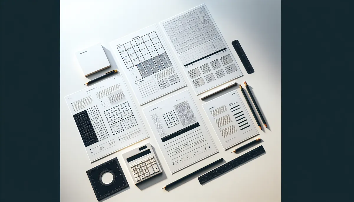
How to Choose: A Decision Tree
Still unsure? Use this simple framework:
How many workouts in this section?
- 1-3: Carousel (let them shine)
- 4-8: Carousel or Narrow Cards (depends on focus)
- 8-20: Narrow Cards or Grid (visual content matters)
- 20+: List or Grid (choose based on vibe you want)
What’s the primary goal of this section?
- Feature specific workouts: Carousel
- Help clients discover: Narrow Cards or Grid
- Organize by program/progression: List
- Show variety: Narrow Cards or Grid
What’s the vibe?
- Professional and minimal: List
- Modern and premium: Carousel or Grid
- Balanced and accessible: Narrow Cards
Mixing Layouts in One Studio
Here’s a pro move: use different layouts for different sections in the same studio.
Example studio:
- Section 1: “This Week’s Featured” → Carousel (3-4 workouts)
- Section 2: “Beginner Workouts” → List (20+ detailed options)
- Section 3: “HIIT & Cardio” → Grid (25+ consistent workouts)
- Section 4: “Recovery Sessions” → Narrow Cards (10 recovery-focused workouts)
This strategy leverages the strengths of each layout. Clients get a curated, magazine-like experience when browsing different sections.
The Live Preview Advantage
HubFit’s live preview feature is your best friend here. After choosing a layout:
- Click “Live Preview”
- See exactly how that layout looks on web
- Switch to mobile view and see how it scales
- Tap around like a client would
- Ask yourself: “Does this feel easy to navigate? Do I want to click more?”
If something feels off, change it. Layouts are fully editable. Swap them out until it feels right.
Pro Tips for Layout Success
Tip 1: Refresh Carousel Sections Frequently
Carousel Layouts make a statement. Change them weekly or monthly so clients have a reason to keep coming back.
Tip 2: Use Consistent Naming Conventions
Regardless of layout, consistent workout names help clients find what they’re looking for. “Upper Body Day 1,” “Upper Body Day 2,” etc., reads better than random titles.
Tip 3: Consider Mobile-First
HubFit’s layouts are mobile-optimized, but test every section on a phone. That’s likely where clients are browsing.
Tip 4: Start Simple, Experiment Later
If you’re launching your first studio, start with List Layout. It’s fast, clean, and requires zero design thinking. Experiment with Carousel, Narrow Cards, and Grid once your studio is live and you have real client feedback.
Tip 5: Match Layout to Content Type
Strength-focused studios work great with Grid (showing many exercises). Program-based studios shine with List (step-by-step progression). Featured content loves Carousel.
Final Thought: There’s No Wrong Choice
The truth is, any layout works if the content is good and organized logically. Don’t overthink it. Choose based on what feels right for that section, launch, and then refine based on how clients actually use it.
The beauty of HubFit is that you’re never locked in. Swap layouts, reorganize sections, and evolve your studio based on real client feedback. That iteration is what makes great studios great.
Ready to organize your content strategically? Explore 10 section ideas that keep clients engaged to plan which sections you want to create first.
Want more foundational knowledge? Check out the Workout Studio Ultimate Guide for Online Coaches for the full picture.

The HubFit team shares expert insights on training, nutrition, and wellness to help coaches and clients achieve their fitness goals.