How to Choose the Best Layout for Your On-Demand Resource Library
List, carousel, narrow cards, or grid? Learn which layout works best for different types of coaching resources.
A beautiful layout makes the difference between a library clients browse and one they ignore.
The same 10 resources can look boring or inspiring depending on how you present them. This guide breaks down every layout option, when to use each one, and how to mix them for the best result.
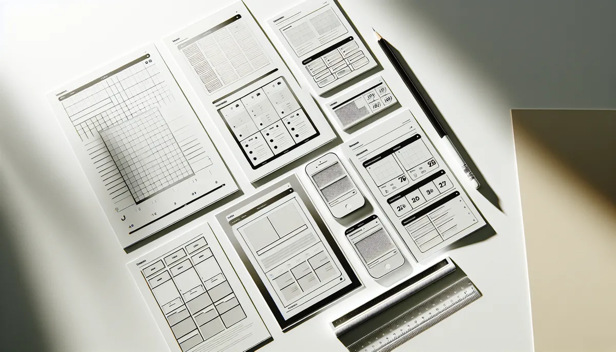
The Four Main Layouts
Most platforms offer these core layouts. You choose one per section.
List Layout
The list is the simplest and most scannable layout. Resources appear as a vertical menu, one after another. Each item shows title, description, and possibly a small thumbnail.
Think of it like a reading list or restaurant menu.
Pros:
- Clean and scannable
- Easy to see many items at once
- Works great on mobile
- Familiar to everyone
- Best for text-heavy content
Cons:
- Not visually exciting
- Doesn’t showcase images well
- Can feel boring if overused
Use list layout for:
- Written guides and articles
- FAQ sections
- Educational content with descriptions
- When you have more than 10 items
- Anything where title and description matter more than visuals
Example sections using list:
- “Frequently Asked Questions”
- “Nutrition Guides & Articles”
- “Getting Started: Step-by-Step”
- “Recovery Tips & Strategies”
Large Cards / Carousel Layout
Large, beautiful cards that clients tap or swipe through. Each card is big, prominent, and can feature a large image or thumbnail. One card takes up most of the screen.
Think Netflix homepage or Instagram story-style. One item gets all the attention, then you swipe to the next.
Pros:
- Very visually appealing
- Draws attention to each resource
- Great for videos (plays natively)
- Feels premium and modern
- Works on mobile and desktop
- Perfect for featuring content
Cons:
- Shows fewer items at once (clients have to swipe)
- Takes more scrolling to see everything
- Each resource needs a good thumbnail or image
Use carousel layout for:
- Featured or important resources
- Video content (YouTube videos play natively)
- When each resource is a standalone topic
- Smaller collections (5-8 items)
- Anything you want clients to notice and engage with deeply
Example sections using carousel:
- “Featured Exercise Videos”
- “Exercise of the Month”
- “Video: How to Use Your App”
- “Core Concepts: One Deep Dive at a Time”
Narrow Cards Layout
Vertical cards with thumbnail image, title, and description. Kind of a middle ground between list and carousel.
Cards stack vertically, each card shows image + title + description. Slightly narrower than carousel, more compact but still visually rich.
Pros:
- Balanced: visual appeal with scannability
- Shows description without overwhelming
- Great for items with varied lengths
- Works well for recipes, tools, equipment guides
- Clean, modern look
Cons:
- Takes slightly longer to scan than pure list
- Requires thumbnail images
- Cards take up more vertical space
Use narrow cards layout for:
- Recipes and meal ideas
- Tools and equipment guides
- Product recommendations
- Workout templates
- Anything where image, title, and description all matter
Example sections using narrow cards:
- “Favorite Recipes by Macro Type”
- “Recommended Equipment & Tools”
- “Client Success Stories”
- “Supplement Guide: Product Breakdowns”
Grid Layout
Thumbnail grid, like Pinterest or Instagram. Images arranged in a grid, usually 2 or 3 columns depending on screen size. Tap to open.
Pros:
- Visually striking and modern
- Great for showcasing multiple items at once
- Leverages visual thumbnails powerfully
- Feels like a gallery
- Encourages exploration
Cons:
- Thumbnail quality matters a lot
- Descriptions are minimal until you click
- Takes more scrolling on mobile
- Needs good images for all items
Use grid layout for:
- Large collections of visual resources
- Exercise libraries (organized by movement)
- Image-heavy content
- Anything where thumbnail tells the story
- When you have 15+ similar items
Example sections using grid:
- “Upper Body Exercise Library”
- “Lower Body Exercise Library”
- “Recovery Stretches & Mobility”
- “Equipment & Tool Directory”
Matching Content Type to Layout
Here’s how to think about it. Most platforms offer these four core layout options, and tools like HubFit let you test each layout on your content before committing:
| Content Type | Best Layout | Why |
|---|---|---|
| Form videos | Carousel | Each video deserves spotlight |
| Written guides | List | Scan through options quickly |
| Recipes | Narrow Cards | Image + description is key |
| Large exercise library | Grid | Browse many visually |
| Articles & links | List | Titles and descriptions matter |
| Featured tutorials | Carousel | You want clients to watch |
| Meal ideas | Narrow Cards | Visual + details |
| FAQs | List | Scannable questions |
| Product recommendations | Narrow Cards | Need description details |
| Exercise movements (many) | Grid | Visual browsing |
Mixing Layouts in One Library
You don’t have to use the same layout for every section. In fact, mixing layouts keeps the experience fresh and matches content to presentation style.
Example: Comprehensive Nutrition Library
Section 1: “Macros Explained” (List layout) Why? Guides, articles, educational content. Clients want to read and understand. List lets them scan titles, tap to read.
Section 2: “Recipes & Meal Ideas” (Narrow Cards) Why? Visual appeal matters here. Recipe images draw people in. Descriptions help them decide. Narrow cards are perfect.
Section 3: “Video: Meal Prep Mastery” (Carousel) Why? One featured video worth watching deeply. Carousel draws attention, video plays natively.
Section 4: “FAQ” (List) Why? Questions and answers. Pure text. List is fastest to scan.
Clients scroll through and experience variety. Not boring.
Example: Form Library With Mixed Layouts
Section 1: “Featured: Deadlift Deep Dive” (Carousel) Your best deadlift video form breakdown as a featured carousel. Gets top real estate.
Section 2: “Upper Body Movements” (Grid) Multiple upper body exercises as a visual grid. Clients browse and pick which form check they need.
Section 3: “Lower Body Movements” (Grid) Same approach, lower body focus.
Section 4: “Common Form Mistakes” (List) Articles or guides about mistakes. Pure text. Scan through.
Section 5: “Form Cues & Checklist” (Narrow Cards) Your custom cue sheets for different movements. Image (or document thumbnail) + cues + description.
Again, variety. Engaging. Not monotonous.
Design Best Practices for Each Layout
List Layout Tips
- Use clear, scannable titles
- Keep descriptions short (one sentence is fine)
- Order logically (most important first, or alphabetical)
- Add icons or emojis to differentiate types (optional)
- Test on mobile; lists should be easy to tap
Carousel Layout Tips
- Ensure every resource has a good thumbnail/image
- Titles should be visible and readable
- Consider size and aspect ratio consistency
- Don’t put too many items (5-8 per carousel works best)
- Remember: swiping is required to see everything
Narrow Cards Layout Tips
- Thumbnail image quality matters
- Titles should be 4-8 words, clear
- Description should be 1-2 sentences
- Keep descriptions roughly consistent length
- Ensure mobile cards are tapable (good hit target)
Grid Layout Tips
- All thumbnails should have similar aspect ratio
- High-quality images are essential
- Consider 2 columns on mobile, 3+ on desktop (platform handles this)
- Titles show on hover (on desktop) or overlay (on mobile)
- With 15+ items, organize into sub-groups logically
When to Split Into Multiple Collections
Sometimes one giant library with 10 sections makes less sense than two focused libraries with 4 sections each.
Consider splitting when:
- Your library has more than 7-8 sections
- Sections cover totally different topics (Nutrition AND Workouts AND Mindset)
- You want to share some libraries with all clients and others only with certain clients
- Clients would benefit from browsing distinct topics separately
Example: Instead of one monster “Everything” library, create:
- “Nutrition Essentials” (4 sections, focused)
- “Exercise Form Library” (4 sections, focused)
- “Mindset & Motivation” (3 sections, focused)
Clients aren’t overwhelmed. Each library has a clear purpose.
You also get flexibility. New clients see the onboarding library. Advanced clients see specialized libraries.
Pro Tips for Layout Selection
The 15-Second Test
Pretend you’ve never seen your library. Can you find what you need in 15 seconds? If not, change layouts. Use carousel or grid for important things you want clients to find. Use list for secondary content.
Visual Hierarchy
Put your most important resources in the most eye-catching layout. If you have one key video, carousel. If you have 10 reference guides, list.
Mobile-First Thinking
Test every layout on mobile. Carousels that are great on desktop can be annoying on phones (swiping takes effort). Grids need good thumbnail images to shine on small screens.
Consistency Within a Category
If you have two sections with similar content, consider using the same layout. All your exercise libraries should probably be grids (consistent experience). All your written guides should be lists.
But feel free to break this rule if content type demands it.
Common Layout Mistakes to Avoid
Using Carousel for Too Many Items
Carousel with 20 items? Clients give up. Keep carousel to 5-8 items max.
Using Grid Without Good Images
Grid with blurry or missing thumbnails looks unprofessional. Use list instead if images aren’t good.
Making Descriptions Too Long
List and narrow card layouts show descriptions. Keep them short. One sentence. Clients read fast.
Ignoring Mobile Preview
Your beautiful desktop layout might be awkward on mobile. Always preview on both.
Overusing List
List for every section feels boring. Mix it up.
Picking Layout Before Gathering Content
Do it backwards. Gather your resources first. Then pick layout that fits. Don’t force content into a layout just because you like it.
Next Steps
You now understand layouts. Time to apply:
- Audit your current libraries (if you have them). Does each section use the right layout?
- When building your next library, choose layout based on content type, not preference.
- Test on mobile. Iterate.
- Ask clients: “Did you find what you need?” If not, maybe try a different layout.
For deeper guidance, explore:
- How to Create Your First On-Demand Resource Library - Implementation steps
- How to Organize Your On-Demand Resource Library for Max Engagement - Optimization after choosing layouts
- 10 Resource Library Section Ideas Your Coaching Clients Will Love - More inspiration on sections and their layouts
Pick the right layout. Clients notice. They browse more. They use your resources. That’s the goal.

The HubFit team shares expert insights on training, nutrition, and wellness to help coaches and clients achieve their fitness goals.